For Week 5, the project was Vehicles. This area is something I am interested in so I really did enjoy working on the project. However, like last year I was slightly frustrated because there were no boundaries. The reason I dislike this amount of freedom is because I believe constraints and limitations progress creativity far more than the ‘do what you like’ approach. I think it can also minimize students who might not consider validity and purpose in design. That being said, it was time to crack on with some designs, I did land last year so I figured why not try air! This was the first time I had drawn/learnt about planes so it was a learning curve trying to understand the content before attempting to create something from it.
I love racing, the idea of pushing machines to their limits in speed and durability is fascinating so when I discovered they do this with planes at events such as the ‘Red Bull Air Race’ I was rapidly drawn to it. I also looked at classic WWII fighters such as the P51-Mustang, Spitfire and Messerschmitt Me 262 (jet), I tried to understand what makes these planes so famous, alongside their capabilities ofcourse. These designs seem to have aggressive forms, almost like a shark from the front, with short wing bases that suggest agility. The tip of the propeller got my attention first, if this attribute were to be exaggerated, I was convinced the results would bring a more bold design that shows its greater purpose of speed. I didn’t see reason in adding random shapes onto this well identified silhouette as I thought it would only alienate the designs ability to convey its purpose (racing).
After being inspired by the Heinkel He 178 (first practical jet aircraft) I looked at jet technology and came across the SR-71 Blackbird. Its jet designs truly do define the word ‘speed’ and I had to adopt this influence somewhere along my design process. At this stage I had the whole ‘function defines form’ state of mind, so I wasn’t going to add random forms simply for the cool factor, instead I wanted as much credibility as possible with this project so everything needed purpose. After doing some side views, I decided to jump into some perspective drawings to get a further understanding on what I wanted to develop from my silhouettes. This lead to an elimination process where I found myself drawing quite a few similar variations of planes, I did also draw pilots in most of the sketches just for a mental note on scale. I do constantly look back at Scott Robertson’s work as he is one of my favourite vehicle artists. I also had influence from a Sci Fi pioneer/illustrator called Chris Foss, his work is outstanding in all matters of design and innovative thinking; not to mention it is all traditional as he was doing these great paintings since the 1970’s before a digital medium had been developed. His work influenced me to add graphics, decals, and other patterns I thought could attain a retro style. I also added in these because I wanted each plane to be identifiable in its uniqueness, this idea came from the film ‘Red Tails’ which I have blogged about earlier.
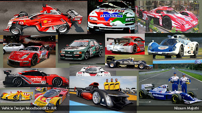
After developing what I thought would be a functional design, I began coming up with finals. I do kick myself a little for not experimenting further into traditional colour, I feel as though it is always good to get out the paint pots before you jump into to Photoshop because it helps reach organic, fresh outcomes however, only having two weeks on this as well as a 3D deadline, I had to finish it all up quickly. I started looking at F1 cars, as well as the Japanese Touring Car Championship, after finalising the plane it was time to look for a method of presenting it. I found using these road racing cars as a template would work well because of its similar nature. At this point it did cross my mind to make up a manufacturer of my own including badges, sponsors etc. The reason I didn’t do this was because existing vehicle manufactures give far more credibility and are easy to identify with.
I wanted to push this idea further into a world where these things could exist, so I decided to continue with a ‘controversial’ final design from Nissan, it was inspired by the turbo charged f1 cars from the 70’s which claimed many lives, but still went on the track for many years. I decided to add excess fuel tanks to the exterior of the design to reduce the number of pit stops thus giving the plane a huge advantage. Ofcourse this design is very impractical and dangerous but I wanted this ‘sport’ to be in its early stages where rules and regulations had not been developed thoroughly. The idea is the manufacturer is claiming 100% safety with its new material that encases the fuel, claiming it to be ‘crash proof’.
This project was very exciting and refreshing to work on, if I to add anything, it would definitely be details like designing landing gear, seat ejection/safety, pilot suit, and even the environment the planes could race in. I think when I do find time I will be adding at least a couple of these things to the project.


