(Raphael, School of Athens, 1509)
An article I found breaks it down into steps, starting with
foreground interest. Doing this can add strong scale and field of depth to the image;
it also helps ease or direct the eye to a single focal point towards the
centre. Secondly, the rule-of-thirds is a classic. This technique provides
visual balance and also helps place the horizon line, the idea is to choose
what you what the greater third to be, sky or ground. Finding lines or patterns
in perspective is definitely something to look for, as it brings such great
depth to the image, it can help divide the image and assist the focal point or
direction. The article quotes a photojournalist ‘Robert Capa’ and he said “If a
picture’s not good enough, you weren’t close enough”. Though it can be applied
to many contexts it suggests that simply finding interesting material and
snapping a shot is not the way to go, but to adjust your viewpoint and eye
level (horizon line) can bring better compositions. For example, laying the
camera roadside instead of holding it could bring far more exciting imagery
than simply holding it eye level.
Format and frames are critical to a great shot, landscape
photos or 16x9 ratio imagery are always great, but adjusting this ratio can add
more energy as the eye has to travel in another direction completely. Using
elements in the shot to frame the image can also be valuable. Bridges or overhanging
trees can help direct the eye to the focal point. Finally, breaking rules can
work to your advantage. I’ve found that applying a few of these rules can bring
better outcomes than applying them all at once, as an artist constantly trying
to find decent shots for final pieces, I can adjust these things to grasp a
more suited image for my work. As the article summarises, it is important to do
everything for a reason and to make it count.
(^breaking the rules by putting something directly in the middle, great result!)
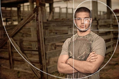
When discussing composition, the Golden Ratio always turns
up in discussion. Though found through mathematics, it is widely known by
Biologists, musicians, historians, artists and architects as well as other
fields. So what is it and how does it relate to me? A blog post I found
suggests the Golden Ratio is a mathematical formula that provides aesthetically
pleasing composition and is behind the success of the rule of thirds. Using
this when creating images/taking photo’s; consciously applying the Golden
Rectangle, Golden Triangle and Golden Spiral can bring much more aesthetically
pleasing outcomes. It is important to fully grasp these methods as art students
as I feel that without a method to FIND a good composition, you are left with
guess work and opinion.


No comments:
Post a Comment