The forgotten posts, Week #3 and #4 review
I do realise
that these briefs I am about to review have been overdue as I completed them
months ago, but it is something I have to get done because I do believe
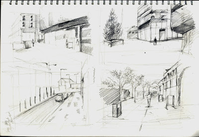
reflecting is important. For Week 3 we were taken through Leicester City
Centre, the goal of the brief was to complete many quick sketches in an almost
storyboard fashion. To get a better idea of what our tutors wanted we were
directed towards an artist’s called Gordon Cullen, an artist who had alongside
other finished works, completed many quick sketches. Cullen’s basis was
architecture so things like perspective, horizon line, and scale appeared very
accurate. This is what we needed to achieve in limited time to get us in the state
of mind where we could draft ideas accurately.


I found this
exercise quite nice to do, the freedom of just finding interesting areas and
jotting them down without worrying about a final piece or development work.
Although I am not a huge fan of standing up with an A3 sketchbook, awkwardly
trying to draw, it does push you out of your comfort zone. I also think that
when pushed out of your nice little room with warmth, internet and supplies,
you do have to work harder to achieve a gratifying result. After working
through with pencil and pen, I did quickly work with a black marker, I think it
helps define lighting quite dramatically as you are only using two values.
Overall I was happy with this brief and I think a few digital sketches could
not hurt, maybe something more refined that explores colour.


For week
four we found ourselves beamed down into Bradgate Park. It is similar to Abbey
(where we went during week one) in terms of what’s there, grass, trees and
water; however it has some very dramatic hills. I do prefer it over Abbey
myself because it’s not as ‘neat’; you can walk through thicker grass and reach
up high hills looking down into other pathways. The day we went it was raining
so I had to put the sketchbook away after the first hour or so, for its own
safety ofcourse. I did manage to take many photographs and discovered my
attraction towards the water once again.


After
working through some thumbnails in pencil I realised I wanted to develop my
ability to portray organic foliage with realism and try to understand how light
workings around these forms, I pushed what I preferred into acrylics to
identify colours. This time the water didn’t catch my eye because of the
ripples but more for a centre focal point. As now we are meant to be thinking
of composition a whole lot more, I wanted something to contrast the various
greens that would be making up 90% of the painting for my final. I was quite
happy with it; maybe I could add more detail into the foreground alongside more
contrast as well. What I did realise is that you can’t rely 100% on photographs
and a camera (especially is it isn’t something of very good quality) it tends
to compress the colours, so if you don’t add more vibrancy you tend to get a
very gloomy outcome.
No comments:
Post a Comment