Friday, 9 November 2012

Loughborough Station!


The second assignment for visual design leads us to Loughborough train station, an old place that seemed not to be in use, although we were told trains were active on tracks throughout certain times of the day. This turned out to be much more exciting for me than the parks we visit because of the change from natural environment to hard surface man made constructions. The station had a workshop that sat further down the tracks, with many old (what looked like) steam engines that were in repair or maintenance. It was great to get up close to get a real idea of their materials and scale. I personally really enjoyed this place, though I didn’t think much of it then, I have come to realise that it was also a perfect place to get surface textures for 3D work; dammit brain!! 

I did some quick thumbnails on sight, very quick mark making to get achieve a better understanding of the trains in perspective and what type of environments they sit in. Though it wasn’t perfect weather the outcomes helped provide a starting point. After going through my reference images I moved on to using marker and paints with a prominent focus on the trains themselves, I felt that to achieve a decent final piece the perspective will have to be as accurate as my ability will allow so I practised that here. It wasn’t all too difficult, but it brought reassurance that I am learning more and more, kind of like repeating a task over and over until you know it inside out, and then repeating it a few more times. I must say I always stay away from acrylics or any sort of paint but after looking at 70’s and 80’s sci artists such as Syd Mead, John Harris and Ralph Mcquarrie and their outstanding abilities before digital painting even existed, I felt I needed to do some traditional painting, even if it was quick mark making. 

After doing this, I began digital colour studies to assist my final, though none of the thumbnails here made the final; it was a great way to understand the existing colours in the area and the lighting of the exterior studies. The final went well but it was a little rushed as I had to move on with other work, I may go back in to add more detail but for now I will call it finished. A good weeks work for learning basic vehicle forms and hard surface lighting.    
   

Saturday, 3 November 2012

Red Tails!

So since last week we have been given a vehicle project for our visual design brief, I have started pushing my ideas towards aircraft and really do love the designs of the war planes from the 30’s/40’s. Powerful, fast and agile veterans like the P-51D Mustang, Supermarine Spitfire and Messerschmitt Me 262 (jet) all hitting 350mph+ inspired me to take these attributes and use them for racing purposes. I also looked at Red bull air race planes which are of very similar design.

I happened to stumbled upon a recently released film called ‘Red Tails’ which was about the Tuskegee airman, the first African American military aviators to fight in the Second World War. The film focuses on a group of friends undertaking missions for their country, and exceeding in every task whilst being subject to racism and racial segregation. As a film in itself it wasn’t the best I have ever seen but did touch on decent historical references and had some awesome dog fights/close combat scenes of the P-51 Mustang. As the film climaxes the African American aviators are given brand new P-51’s to replace their old ‘hand me down’ planes and this gift comes with life threatening missions against the Nazi fighters. 
As I am not judging this film a as media student or some sort of critique I can disregard all the patriotism and predictive storyline as it did seem like each time the pilots hit the skies, something was bound not to go their way and the only pilot to fall in love + get married, just happens to be the one that dies…  ‘Spoiler’. Although I did enjoy the film myself as it does have one of those typical heart-warming messages that regardless of racial background, we are all capable equally; being that it was based on true events also helped. Considering Aesthetics, I really do love the idea of the ‘red tail’ on the Mustang, a unique marking showing to all who they are and what they are capable of. I think I will be applying something similar to my vehicle design, not in the form of what it looks like, but what it represents; a logo, colour, or marking to suggest something powerful. 
Obviously there are greater forms of research you can do, than just watch a film or two, and on the day the brief was given I did manage to head over to the store ‘The Works’. After purchasing two huge books on Flight and Ships, it was almost like finding treasure. For less than £10 each both contain over 300 pages on the development of aviation and maritime throughout history! Building a library of content is very important so I am always on the lookout for these things, vehicle designs coming soon!     

Trash!

Coming back to Visual Design was not much of a challenge, game production class was a little more unsettling so I was happy when the brief was something simple, easy and primarily there as a recap on what we already know. The brief was to find some interesting trash wherever you can, model it in 3D and come up with some decent renders, 3 weeks to do that! Although of course we do have other deadlines from the other 2 modules but it seemed straight forward enough. 

I began searching for trash around where I live and through the city centre (Peterborough) where there seems to quite a bit of trash usually, although in people form… OHH BURRNED! I joke I joke. I wasn’t sure if I was looking for anything specific, bin bags and old boxes seemed to be reoccurring more than I liked. As we were meant to find interesting objects, it was annoying to say the least. I did begin working on a skip idea however; the plan was to create a mucky, old, run down skip that had been sitting in one place for decades. The 500 tri limit put this idea to rest quickly because I didn’t want an empty skip as every single one I found in real life was overflowing with crap. Going to Loughborough train station in between those 3 weeks gave me a better idea of ‘unique’ trash and from here I realised that it all has to sync, with a shadowing theme as everything at the station that was thrown out was of course used on, used for or from the trains.
With this loose ‘theme’ idea in mind I decided to have a look closer to home and pretty much raid the shed we had packed with junk from the distant past. I managed to find boxes of old Bollywood records and cassettes my dad had been collecting since before I was born, this was certainly appealing as it would hold a basic theme of music. With this as my primary focus I choose to add a speaker I found lying around under the bed. This was a challenge as I didn’t have any tri’s to show its depth, so for this asset, I was heavily reliant of the bump map.


Putting it together was not a problem, adding old food packaging and garbage bags were of course essential to show it is after all, random crap thrown out. I had a little issue with the spec/bump maps for both the speaker and bin bags, it seemed difficult to get a ‘realistic’ look but in the end I managed to make it half decent. The final renders were done using a daylight system in Max, maybe next time I will have to teach myself Marmoset to compare final renders but for now I was content. I definitely learned with this task not to underestimate the simplicity of a brief, as the most basic and easy tasks can bring unique individuality and limitations can also develop creativity. If I were to do anything different, I may have gone towards car parts, gas cylinders, and other scrap yard related things. It seems very interesting to explore these because of their metallic and reflective nature.  Is this an idea for a personal project!? I don’t knowww, Couuld Beeee XD …but seriously, I have other things to do first. TO THE TO DO’ LIST!! 


Thursday, 1 November 2012

Elements of game design, part six: visual composition

Ok, one of the most important components of any piece of artwork is composition. This does not only apply to us trying to prosper to the games industry, but in any Art and Design profession it is a well-known fundamental attribute. When creating artwork or taking photographs I have never really put enough thought into composition, it’s almost lingering in the back of my mind as it says ‘this looks good.’ Other times I find myself saying ‘this looks good enough’ and do not put enough effort into taking reference shots or understanding what I am looking at. To assist my learning I had a look at what other, more professional people thought about it.
(Raphael, School of Athens, 1509)
An article I found breaks it down into steps, starting with foreground interest. Doing this can add strong scale and field of depth to the image; it also helps ease or direct the eye to a single focal point towards the centre. Secondly, the rule-of-thirds is a classic. This technique provides visual balance and also helps place the horizon line, the idea is to choose what you what the greater third to be, sky or ground. Finding lines or patterns in perspective is definitely something to look for, as it brings such great depth to the image, it can help divide the image and assist the focal point or direction. The article quotes a photojournalist ‘Robert Capa’ and he said “If a picture’s not good enough, you weren’t close enough”. Though it can be applied to many contexts it suggests that simply finding interesting material and snapping a shot is not the way to go, but to adjust your viewpoint and eye level (horizon line) can bring better compositions. For example, laying the camera roadside instead of holding it could bring far more exciting imagery than simply holding it eye level.
Format and frames are critical to a great shot, landscape photos or 16x9 ratio imagery are always great, but adjusting this ratio can add more energy as the eye has to travel in another direction completely. Using elements in the shot to frame the image can also be valuable. Bridges or overhanging trees can help direct the eye to the focal point. Finally, breaking rules can work to your advantage. I’ve found that applying a few of these rules can bring better outcomes than applying them all at once, as an artist constantly trying to find decent shots for final pieces, I can adjust these things to grasp a more suited image for my work. As the article summarises, it is important to do everything for a reason and to make it count.
(^breaking the rules by putting something directly in the middle, great result!)


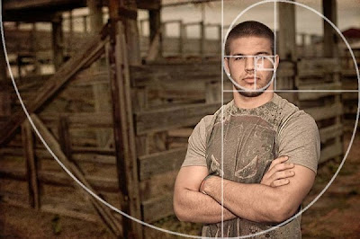
When discussing composition, the Golden Ratio always turns up in discussion. Though found through mathematics, it is widely known by Biologists, musicians, historians, artists and architects as well as other fields. So what is it and how does it relate to me? A blog post I found suggests the Golden Ratio is a mathematical formula that provides aesthetically pleasing composition and is behind the success of the rule of thirds. Using this when creating images/taking photo’s; consciously applying the Golden Rectangle, Golden Triangle and Golden Spiral can bring much more aesthetically pleasing outcomes. It is important to fully grasp these methods as art students as I feel that without a method to FIND a good composition, you are left with guess work and opinion.