Saturday, 3 November 2012

Red Tails!

So since last week we have been given a vehicle project for our visual design brief, I have started pushing my ideas towards aircraft and really do love the designs of the war planes from the 30’s/40’s. Powerful, fast and agile veterans like the P-51D Mustang, Supermarine Spitfire and Messerschmitt Me 262 (jet) all hitting 350mph+ inspired me to take these attributes and use them for racing purposes. I also looked at Red bull air race planes which are of very similar design.

I happened to stumbled upon a recently released film called ‘Red Tails’ which was about the Tuskegee airman, the first African American military aviators to fight in the Second World War. The film focuses on a group of friends undertaking missions for their country, and exceeding in every task whilst being subject to racism and racial segregation. As a film in itself it wasn’t the best I have ever seen but did touch on decent historical references and had some awesome dog fights/close combat scenes of the P-51 Mustang. As the film climaxes the African American aviators are given brand new P-51’s to replace their old ‘hand me down’ planes and this gift comes with life threatening missions against the Nazi fighters. 
As I am not judging this film a as media student or some sort of critique I can disregard all the patriotism and predictive storyline as it did seem like each time the pilots hit the skies, something was bound not to go their way and the only pilot to fall in love + get married, just happens to be the one that dies…  ‘Spoiler’. Although I did enjoy the film myself as it does have one of those typical heart-warming messages that regardless of racial background, we are all capable equally; being that it was based on true events also helped. Considering Aesthetics, I really do love the idea of the ‘red tail’ on the Mustang, a unique marking showing to all who they are and what they are capable of. I think I will be applying something similar to my vehicle design, not in the form of what it looks like, but what it represents; a logo, colour, or marking to suggest something powerful. 
Obviously there are greater forms of research you can do, than just watch a film or two, and on the day the brief was given I did manage to head over to the store ‘The Works’. After purchasing two huge books on Flight and Ships, it was almost like finding treasure. For less than £10 each both contain over 300 pages on the development of aviation and maritime throughout history! Building a library of content is very important so I am always on the lookout for these things, vehicle designs coming soon!     

Trash!

Coming back to Visual Design was not much of a challenge, game production class was a little more unsettling so I was happy when the brief was something simple, easy and primarily there as a recap on what we already know. The brief was to find some interesting trash wherever you can, model it in 3D and come up with some decent renders, 3 weeks to do that! Although of course we do have other deadlines from the other 2 modules but it seemed straight forward enough. 

I began searching for trash around where I live and through the city centre (Peterborough) where there seems to quite a bit of trash usually, although in people form… OHH BURRNED! I joke I joke. I wasn’t sure if I was looking for anything specific, bin bags and old boxes seemed to be reoccurring more than I liked. As we were meant to find interesting objects, it was annoying to say the least. I did begin working on a skip idea however; the plan was to create a mucky, old, run down skip that had been sitting in one place for decades. The 500 tri limit put this idea to rest quickly because I didn’t want an empty skip as every single one I found in real life was overflowing with crap. Going to Loughborough train station in between those 3 weeks gave me a better idea of ‘unique’ trash and from here I realised that it all has to sync, with a shadowing theme as everything at the station that was thrown out was of course used on, used for or from the trains.
With this loose ‘theme’ idea in mind I decided to have a look closer to home and pretty much raid the shed we had packed with junk from the distant past. I managed to find boxes of old Bollywood records and cassettes my dad had been collecting since before I was born, this was certainly appealing as it would hold a basic theme of music. With this as my primary focus I choose to add a speaker I found lying around under the bed. This was a challenge as I didn’t have any tri’s to show its depth, so for this asset, I was heavily reliant of the bump map.


Putting it together was not a problem, adding old food packaging and garbage bags were of course essential to show it is after all, random crap thrown out. I had a little issue with the spec/bump maps for both the speaker and bin bags, it seemed difficult to get a ‘realistic’ look but in the end I managed to make it half decent. The final renders were done using a daylight system in Max, maybe next time I will have to teach myself Marmoset to compare final renders but for now I was content. I definitely learned with this task not to underestimate the simplicity of a brief, as the most basic and easy tasks can bring unique individuality and limitations can also develop creativity. If I were to do anything different, I may have gone towards car parts, gas cylinders, and other scrap yard related things. It seems very interesting to explore these because of their metallic and reflective nature.  Is this an idea for a personal project!? I don’t knowww, Couuld Beeee XD …but seriously, I have other things to do first. TO THE TO DO’ LIST!! 


Thursday, 1 November 2012

Elements of game design, part six: visual composition

Ok, one of the most important components of any piece of artwork is composition. This does not only apply to us trying to prosper to the games industry, but in any Art and Design profession it is a well-known fundamental attribute. When creating artwork or taking photographs I have never really put enough thought into composition, it’s almost lingering in the back of my mind as it says ‘this looks good.’ Other times I find myself saying ‘this looks good enough’ and do not put enough effort into taking reference shots or understanding what I am looking at. To assist my learning I had a look at what other, more professional people thought about it.
(Raphael, School of Athens, 1509)
An article I found breaks it down into steps, starting with foreground interest. Doing this can add strong scale and field of depth to the image; it also helps ease or direct the eye to a single focal point towards the centre. Secondly, the rule-of-thirds is a classic. This technique provides visual balance and also helps place the horizon line, the idea is to choose what you what the greater third to be, sky or ground. Finding lines or patterns in perspective is definitely something to look for, as it brings such great depth to the image, it can help divide the image and assist the focal point or direction. The article quotes a photojournalist ‘Robert Capa’ and he said “If a picture’s not good enough, you weren’t close enough”. Though it can be applied to many contexts it suggests that simply finding interesting material and snapping a shot is not the way to go, but to adjust your viewpoint and eye level (horizon line) can bring better compositions. For example, laying the camera roadside instead of holding it could bring far more exciting imagery than simply holding it eye level.
Format and frames are critical to a great shot, landscape photos or 16x9 ratio imagery are always great, but adjusting this ratio can add more energy as the eye has to travel in another direction completely. Using elements in the shot to frame the image can also be valuable. Bridges or overhanging trees can help direct the eye to the focal point. Finally, breaking rules can work to your advantage. I’ve found that applying a few of these rules can bring better outcomes than applying them all at once, as an artist constantly trying to find decent shots for final pieces, I can adjust these things to grasp a more suited image for my work. As the article summarises, it is important to do everything for a reason and to make it count.
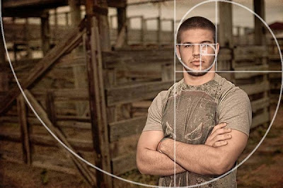
(^breaking the rules by putting something directly in the middle, great result!)


When discussing composition, the Golden Ratio always turns up in discussion. Though found through mathematics, it is widely known by Biologists, musicians, historians, artists and architects as well as other fields. So what is it and how does it relate to me? A blog post I found suggests the Golden Ratio is a mathematical formula that provides aesthetically pleasing composition and is behind the success of the rule of thirds. Using this when creating images/taking photo’s; consciously applying the Golden Rectangle, Golden Triangle and Golden Spiral can bring much more aesthetically pleasing outcomes. It is important to fully grasp these methods as art students as I feel that without a method to FIND a good composition, you are left with guess work and opinion.  


Week One - Abbey Park

For the first week our visual design tutor decided to take us to a place called Abbey Park, as it was the first time we had all gotten together to draw I was feeling very motivated to get on with this brief. Now what I learned coming back this year is that last year, we had a set amount of work, so if we did what the tutors said (12 thumbs and 1 final) we would pass (just). If we did more, we would increase our chances of achieving higher marks. For 2nd year it’s more about the learning curve, developing sketches from one level to another. Of course this does not mean to do an insufficient amount of work, but to focus constantly on your own progression as an artist. I began with pencil thumbnails on sight and from my own photos to build some good compositions and get my head around the area. 


Although it’s getting to that time of year where everything is wet, cold, and windy (perfect time to draw!..) the weather decided to be somewhat stable so some nice sketches and photographs were achieved. I was satisfied with my thumbnails at the park and determined what I would do from a select few; these were primarily the sketches with water reflections. Water at the park attracted me most because of its reflective properties, it seemed to be a challenge to repaint everything on the horizon back in as upside down reflections. I really enjoyed this trip and always look forward to the weeks where we have to go out to specific locations and make the most of what is around us; in this case these green landscapes and environments are very useful buildings blocks for designing your own work. Using traditional mediums did prove to be difficult, but quick mark making allowed me to explore colour aswell as understand how water reacts.

This task also helped me understand about colour, how it reacts when water is apparent alongside the time of day and weather/temperature of the environment. I think for these weekly briefs we are expected to work both traditionally and digitally so it gives us a chance to improve our digital skills. My final did take me longer than I hoped as I am still new to digital painting; but because of this I picked up some some new techniques and after the thumbnails I found a specific workflow that was best for me. It is important to know that environments are heavily reliant of perspective and lighting, as most things are, but specifically these attributes really have to be nailed when it comes to environment’s to present forms and depth of field accurately.

       
As a personal reflection on this week’s task I will probably add a traditional final and some more value sketching to solidify my traditional skills. Although I do not have the greatest interest in environments, Abbey Park is quite a unique place with flat landscapes and interesting areas to study, it seems like a great place to go back to now and then do study light in green areas. Digital painting is difficult when you have not had much proper practise. but after many more weeks of this I am getting more and more comfortable with it.

Elements of game design, part five: planning and concepting

Planning and Concepting. What’s that you ask? Let me explain in the most detailed and linear of ways so everyone has an equal understanding and can produce amazing work, equally. That’s just it. It is such an individual and personal process to produce high quality, successful designs and content that you can’t summarise it for everyone. We all think differently so in turn our thought process to solve problems through drawing will be diverse. However saying that, you can break it down to people get an idea of what goes on. At the same time, I feel as though this is a learning curve for me because as an art ‘student’ my knowledge can be limiting as I am still learning myself as briefs and projects come and go.


After reading through this huge rant with information here and there (my definition of it) called ‘Art Process Boot Camp’ I learned quite a vast bit about figuring out this process myself. Reading it all was a challenge in itself I must admit, but I gathered that everything must be referenced. This Idea I touched on in my last post about doing it WITHOUT reference is not something to be proud of. Yet so called ‘artists’ shamelessly brag about it. Another thing that annoys me personally is when people mention the duration work took them to do, as a sense of pride. These things should not matter at all to the audience, the first thing anyone will figure out about mine and every other ‘artists’ work is if it makes sense. Does it work? What is it? Why is it their? Fundamental questions like these should be answered by the viewer simply from a glance, especially when we talk about design.

 
Reference and decision making are key to successful work, and everything should fit the context of the brief or project. This does not mean search for your favorite artists work and leach of it, or find 1 or 2 images from Google. Looking at real life seems to work best, architecture, culture, history, various animal kingdoms, geography, physics, when concepting all this and more should be put through the ‘process’ machine. The thread/PDF file/rant goes on to say working out is a necessity, thumbnails and marking making is crucial to understand what works and what doesn’t very quickly. The quality of these should not matter a great deal as they are like mathematical equations, it does not matter how neat the handwriting they are done in is as long as you can read them. Once a composition has been established, details within should be addressed. Clothes, anatomy, accessories, depth of field, lighting, these and more have to fit the context, in terms of accuracy in portrayal as well as relevance. Again, looking at the ‘why’s and how’s’ of everything helps much more than throwing something in because you think it is ‘cool’ or ‘different.’


After spending hours and hours on a piece of work it is important to show it to others if you are not sure of it yourself, and this brings us to critique. Getting attached on a personal level to a painting/drawing/3d model can skew your perception of your own work, of course it doesn’t help if all your friends know no nothing about art so when they see your rip off sketch from your favorite anime that did from memory and tell you it’s awesome, it isn’t always the case. Building a critical state of mind towards artwork helps tons in situations like these as it means you understand your own work. When working in industry, it also matters primarily what the boss thinks, so understanding all this becomes essential when trying to keep your job! I found this brief definition of Art Direction that explaining the role so understanding that you alongside others will be working under an Art Director, it gave me a good insight towards what to expect


After also reading through the critique part of the post, I realised that I myself can be very critical of my own work, it can never be good enough at times and because of this I end up not wanting to show it or not move on from it. A kind of perfectionist mentality like this or more severe isn’t healthy as it can cause a skewed perception of your own work in the other direction, where being good isn’t enough. It also made me understand that other people looking at your work might not even half get it, even if you do everything right there will always be people who want to see half naked women with guns, zombies, ninjas, or all of it blurred into one. Even if you have considered what the environment smells like, what a character is thinking and emotions successfully some people just won’t get it. Being too hard on yourself can hinder your skills and cause demotivation. Overall it was a very interesting read to say that even though you cannot exactly define the thinking process behind artwork, you can break it down into steps to HELP those who want to be artists, become more successful. The biggest things I picked up from it for myself were decision making (it if doesn’t fit, get rid of it), purpose, the why’s and how’s and material relationships with the environment (how something reacts to everything else)